Scatter Plot Maker
Paste your x and y values to draw a scatter plot with an optional trend line, the correlation coefficient and the equation, then download the chart.
Recent
Your last 10 settings, saved only in this browser. Nothing is uploaded.
How to use the scatter plot maker
- Click into Data points (x, y) and paste your pairs, one point per line, with x first, then y.
- If your first line holds two column names, the tool uses them as the default axis labels.
- Type a Chart title if you want one. It appears above the plot and in your downloads.
- Leave Draw the least-squares trend line ticked to see the red line, or untick it to hide the line.
- Open More options to type an X-axis label and a Y-axis label. Leave them empty to use your column names, or the letters x and y.
- Check the plot. It redraws every time you change the data.
- Read Correlation coefficient (r) and Trend line equation in the results.
- Click Download SVG or Download PNG under the plot to save it.
The plot and every result update as you edit the data, and the steps list under the results shows the means, the slope and intercept, and r with the sums behind it. To try a pattern before using your own data, click one of the four preset chips. The page address can store your inputs through Copy link, so you can reopen the same setup later. To keep a copy of the results, use Print / save as PDF.
What does the trend line mean?
The trend line is the straight line that best fits your points, found with the least-squares method. It is written as y = a + b·x, where b is the slope and a is the intercept. The tool calculates the slope as b = Sxy ÷ Sxx and the intercept as a = ȳ − b·x̄, where x̄ and ȳ are the means of x and y.
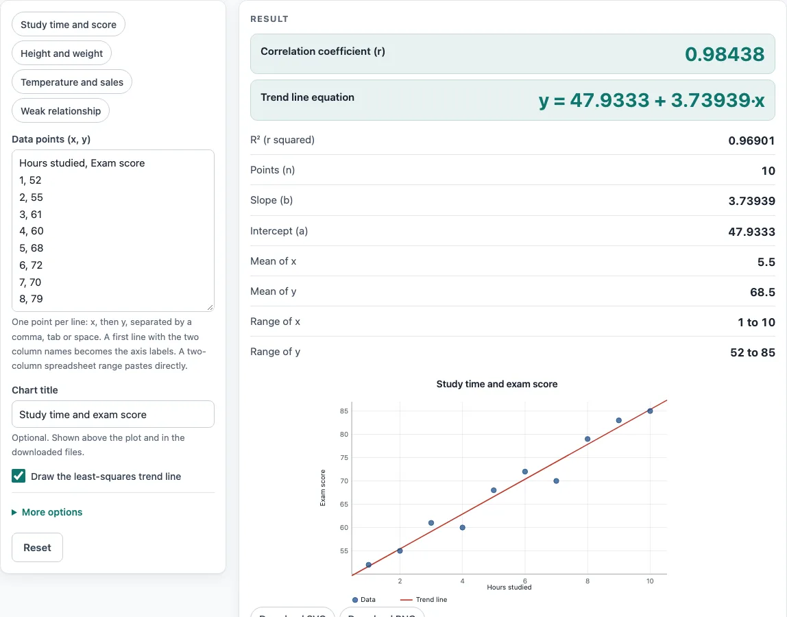
Here Sxx = Σ(x − x̄)² and Sxy = Σ(x − x̄)(y − ȳ). Least squares picks the line that makes the sum of squared vertical distances from the points to the line as small as possible. A positive slope means y tends to rise as x rises, and a negative slope means it falls. For the study time example loaded on the page, the equation is y = 47.9333 + 3.73939·x, so each one-unit rise in x goes with about 3.74 more units of y, on average. The line is a summary, so individual points sit above or below it.
What does the correlation coefficient r tell me?
The correlation coefficient r measures how closely the points follow a straight line, on a scale from −1 to 1. The tool calculates it as r = Sxy ÷ √(Sxx·Syy), where Syy = Σ(y − ȳ)². Values near 1 mean a strong positive linear relationship, values near −1 mean a strong negative one, and values near 0 mean little straight-line relationship. The sign of r always matches the sign of the slope.
The temperature preset gives r = −0.99706, a very tight downward pattern. The study time example gives r = 0.98438. R² (r squared) is the share of the variation in y that the trend line accounts for. For the study time example, R² = 0.96901, so about 97% of the variation in the scores is matched by the line.
What data format does the scatter plot maker need?
Each point needs an x value and a y value, and the two must be paired. The separator can be a comma, tab, semicolon or space, so a copied two-column spreadsheet range works. If your first line has two column names, the tool reads them as labels, not as data.
You can also enter two labelled lists. One line starts with x: followed by the x values, and another starts with y: followed by the y values, such as x: 1 2 3 and y: 4 5 6. Both lists need the same number of values, because each x must match one y.
How many points can I plot?
You need at least 2 points and can plot up to 5,000. With only 2 points, a line always fits exactly, so it tells you nothing about a pattern. The tool shows a warning when you have fewer than 5 points, because a trend line based on so few values can change a lot if one value changes. Your data is still plotted, but treat the line and r with caution.
Worked examples
| Input | Result |
|---|---|
| 10 points | r = 0.9844, y = 47.9333 + 3.73939·x |
| 10 points | r = 0.9812, y = -79.8689 + 0.875556·x |
| 7 points | r = -0.9971, y = 44.25 − 1.375·x |
| 8 points | r = 0.7619, y = 1.07143 + 0.761905·x |
Calculated by the tool above with these values.
Frequently asked questions
Is a scatter diagram maker the same as a scatter plot maker?
Yes. A scatter diagram, a scatter chart and a scatter plot all show pairs of x and y values as separate dots, so this tool handles each name.
How do I download the scatter plot as an image?
Click Download SVG for a vector file that stays sharp at any size, or Download PNG for a picture file. Both have a white background and include your title and axis labels. The PNG is 1280 pixels wide when the plot has no title.
Is my data uploaded anywhere?
No. The plot is drawn in your browser as an SVG, with no chart library and no upload. The page address updates with your inputs so that Copy link can reproduce the plot, but nothing is sent to a server.
Can I print the results?
Yes. Click Print / save as PDF to print the results, or save them as a PDF file from your browser’s print dialog.
Does a strong r prove that one variable causes the other?
No. A high r shows that the points follow a straight line closely, but it does not show that one variable causes the other. A third factor can drive both, or the link can be a coincidence.
What happens if all the x values or all the y values are the same?
If every x value is the same, there is no trend line and no correlation, and the tool shows a warning. If every y value is the same, r is undefined and the trend line is flat.
Related tools
- Correlation coefficient calculator: use it to test whether r is statistically significant, with a p-value and confidence interval.
- Linear regression calculator: use it when you need the full regression output for your data.
- Spearman rank correlation calculator: use it when your data is ranked or the relationship rises or falls steadily without being a straight line.
- Statistics calculator: use it to find other statistics for your numbers.
- Mean, median and mode calculator: use it to find the centre of x or y on its own.
- Box and whisker plot calculator: use it to see the spread and outliers of one variable.
- Standard deviation calculator: use it to measure how spread out x or y is.